
The use of visuals in training content is rising, in part because of the increasing need for remote learning opportunities. Unfortunately, part of this rise is also an increase in bad or confusing visual content.
How can we best evaluate visuals and make them more effective for learning goals? While some best practices have emerged, we’d be wiser to reflect on what practices are supported by academic research.
Fortunately, there have been numerous research studies conducted in the past few decades that can help us better understand how to create visual content that will support training. Here are some of the most significant findings to date and some ideas about how you can use these insights to improve your training content.
1. Visuals can enhance comprehension, memory, and motivation.
A number of studies in the 1970s demonstrated that visuals can aid in comprehension. In the 80s and 90s research continued to show that visuals can help learners better memorize and recall material, and they can also arouse attention and enhance motivation.
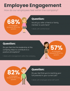
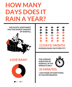
This means it is important for you to visualize the concepts that are more difficult to understand as well as the ones that you want to make sure learners remember. These concepts can be visualized in graphics like flow charts, timelines, diagrams, mind maps, graphs, or process infographics, like the one below.

In more recent years, researchers have said that in particular infographics (short for informational graphics) can be invaluable for sharing complex content in a way that is highly accessible. Infographics are great for training and development and can be used, for example, in internal reports, presentations, training handouts, and job aids.
2. Special care must be taken, especially when visuals are used for learning purposes.
Of course, not all visuals or infographics are effective and it is easy to produce bad infographics. Some of the most significant errors researchers have noted, for example, are irrelevant, unattractive, or inconsistent use of colors, icons, and other visual elements.
One of the most significant mistakes you can make is when you attempt to bundle too much information into one visual, so it’s wise to split complex topics into multiple visuals. This can be done in a series of presentation slides or in parts of a linear infographic that can be scrolled through online.
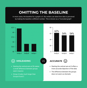
Misleading visuals that cause the learner to draw false conclusions are even more damaging. Studies have shown that misinterpretation of visuals can happen even when the accompanying text is accurate. This means you should place just as much attention on the visuals as you do on the text in your training materials.
All of these errors can not only cause the learner to become confused and inattentive, negating any benefits the visuals may have provided, they can also create negative impressions and mistrust between you and the learner, according to research.
3. Data visualizations can be helpful, depending on attitudes and chart types.
Some visuals are based on data – these are called data visualizations. These can take many forms, such as bar charts, line charts, pie charts, word clouds, pictographs, or maps.
According to studies conducted in 2014, visuals like graphs can be persuasive because they are viewed as being scientific. Note they are less so if the learner has a decreased belief in the importance of science, so you will need to keep your audience in mind as you decide whether to use them.
There has been a lot of debate about whether these visuals can be used to change people’s minds. Research so far indicates that charts may be especially helpful when learners do not yet have existing attitudes about the topic, whereas tables may be more persuasive if learners have attitudes that the data does not support.
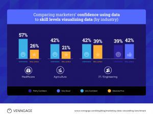
There are so many different types of charts and graphs, and some are more effective than others. Studies have shown that vertical bar charts in particular are the easiest for learners to understand, more so than pie charts or other representations.
4. Colors and images make learnings more memorable – but be cautious that they don’t distract.
Infographics with detailed or elaborate decorations or images are more memorable, according to a study in 2010. This means you can use elements like illustrations and backgrounds to make your visuals easier for learners to recall. Researchers have also found that infographics using multiple colors are more memorable. A platform like Venngage offers colorful infographic templates with these elements already created so it’s accessible for design beginners.
Still, researchers have also said that visuals that are comprehensible “at-a-glance” are more quickly retrieved from memory, even if they are detailed. So the trick to creating memorable visuals is always to balance visual appeal with clarity – too much clutter can bog the learner down. Learners spend the most amount of time looking at the text in visualizations, specifically titles, so you should also make sure this text is limited and drives the message home directly and quickly.
You can also help learners recall information later by using everyday objects in photos and icons, according to researchers. Pictograms, as well as diagrams, can serve as visual hooks, allowing a learner to retrieve knowledge later, research says.
Again, you should look to use visuals that support both comprehension and memory – sometimes you will need to use a straightforward bar graph to communicate data succinctly and other times you can use diagrams that will be more surprising and therefore more memorable for the learner.
While data visualizations, illustrations, and icons can be fun to use, it’s best not to use them unless there’s a clear purpose for them. According to a study in 2010, learners can perceive when visuals are indeed distractions and they will subsequently make assumptions about the designers intentions.
5. Visuals that play a crucial role in learning should be tested.
Designers often use icons and illustrations that they assume learners will understand the meanings of. According to a 2007 study, these assumptions can be entirely false. Cultural background may especially impact a learner’s interpretation of images, so if you are designing materials for learners of various backgrounds, it is particularly important to keep this in mind.
Symbols that are conventional and frequently seen, such as a stop sign, maybe well understood, but those used in different situations to signify different meanings, such as arrows, may cause confusion or even misunderstanding.
Since visuals can play a crucial role in learning, any assumptions that designers make can result in interference with learning objectives. Therefore, you should also test your visuals with target audiences before implementing them broadly, especially if the audience is multicultural.
In summary
Now that you are more aware of the many things to pay attention to when creating visual training content, you will want to prevent any major mishaps and make sure the visuals you create are indeed helpful learning aids. Visuals are game-changers for learners so I encourage you to keep learning about how you might best use them to support employee training and development.

